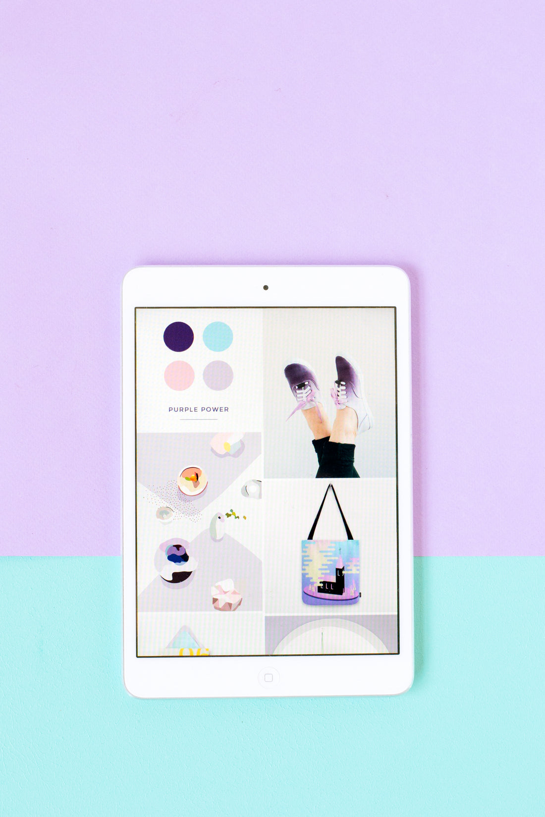
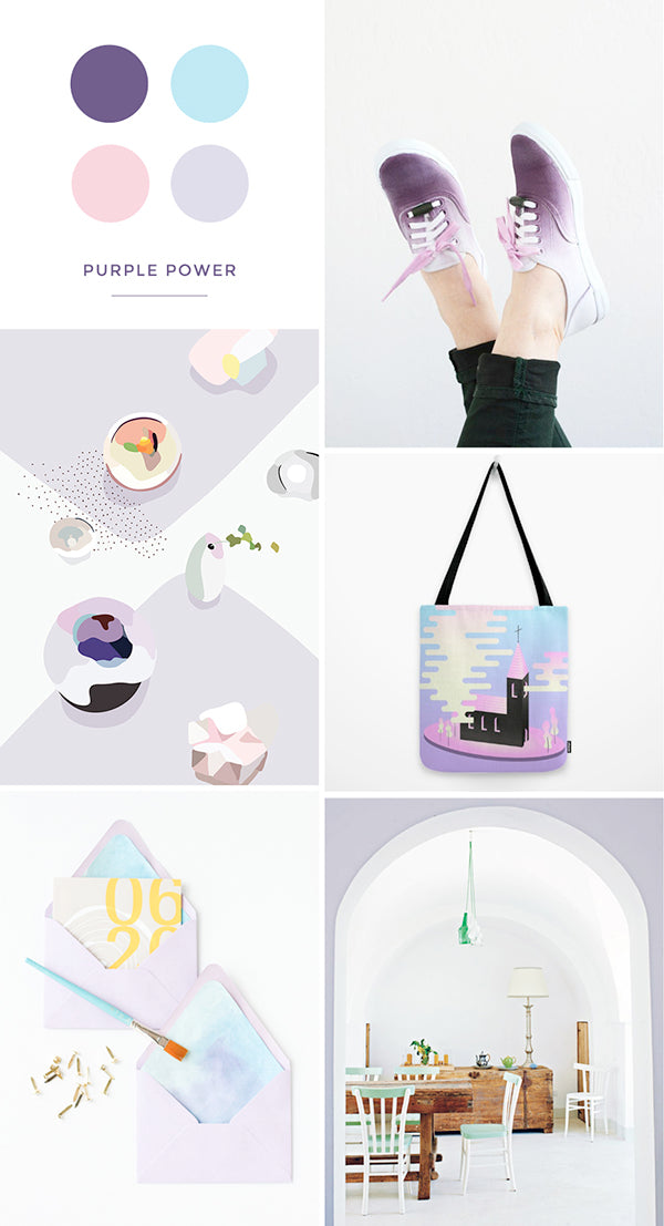
shoes | art | tote | stationery | dining room
Back when I used to own an online paper goods store, my logo was purple and so was all of my business stationery. I’d had my branding professionally designed and although purple wasn’t my first pick, I adored the concept my designer had come up with; so much so that I went along with the plum shades because I knew it fit the designs better than any other colour.
I guess I suffered from overload during that time because I didn’t use purple at all for several years after winding down my business. Fast forward to today though and all of a sudden I’m loving it again, especially the pastel shades. Moral of the story? Time heals all wounds. Haha, I kid; the real takeaway is that every colour can become appealing, even if you don’t like it to start off with!
Have you had a similar experience with a hue that you initially didn’t like but then came to love? Leave me a note below to share your story and keep an eye out for a little more purple on the blog as I slowly wean it back into my designs! 🙂
xx Steph