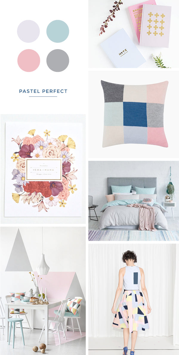
notebooks | cushion | invitation | quilt cover | dining room | skirt
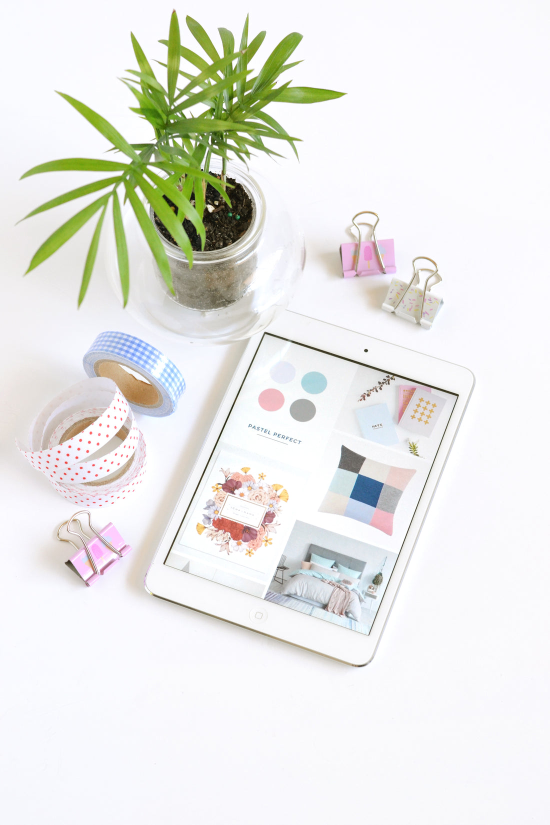
When I first heard that Pantone had released not one but TWO colours of the year for 2016, my first thought was ‘yesssss’.
Which quickly turned into ‘noooo’ when I realised that they were both pastels.
Yep, that’s right, I’m not a pastel person. Up until late last year, I felt like I’d ‘outgrown’ pastels, which I know makes me sound like a right snob, but I’ve always associated those colours with images of princesses and floaty ball gowns and lets face it, I haven’t been into that stuff since I was 12 (okay, maybe 18 😉 ).
But then I saw image after image of these shades being used in clothing and interiors and I started to warm to them. Not fully (not yet anyway), but I’m a lot more friendly towards pastel pinks, lavenders and blues than I used to be. Especially when paired with strong colours like navy and dark grey.
What do you think – are you a fan?
xx Steph